The Pendulum Model

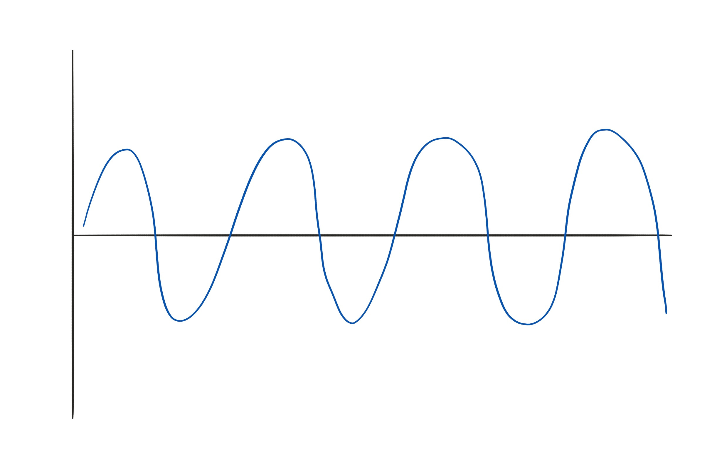
When working with investing clients, I frequently used the Pendulum Model to discuss the stock market and economics. It’s a very simple mental model for thinking about the cyclical nature of systems. But I find it very helpful. Recently there has been lots of talk about inflation, economic growth, and interest rates. I think this simple model can help think about these situations. Imagine a simple pendulum like you might find in a grandfather clock. If you graphed its movement over time, it might look something like this:
If we use this graph to think about a cyclical system, like inflation, I think we can pull some pretty interesting observations from it. For example, what if we are transitioning from a low to a high inflation regime, back to a low inflation regime? I have highlighted this below:
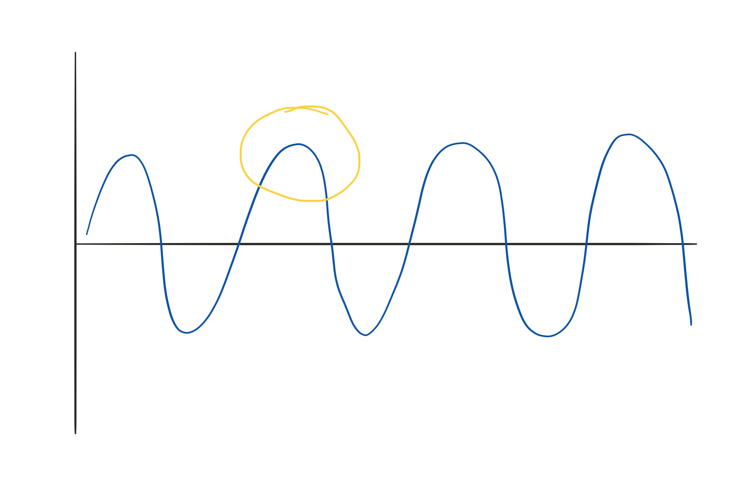
We can make some important observations about this phase of the cycle. For one, you can see that the rate of change in one direction is slowing down and eventually stopping. Imagine the pendulum approaching the apex of its swing: it slows and slows and hangs in one position for a fleeting instant before changing direction and slowly, then more quickly accelerating in the other direction.
If you imagine this as it relates to inflation or some other cyclical phenomenon, you can see that, at some point inflation will slow. For a brief period, everything will be in balance, and there are no big changes one way or another. Perhaps this could create a “Goldilocks” situation where we imagine that inflation is perfectly balanced. Narratives around a soft landing or permanently high plateau could start to take over. But really, we are just getting ready to see a switch in the direction heading the other way completely. Just like the pendulum, this period could be an agonizingly long time where nothing appears to be happening. So it is easy to convince ourselves that this is the “new normal” or whatever.
Another interesting point to consider is our overwhelming fixation on average. Consider the average point on the graph:

At this point in the pendulum’s cycle, it is halfway between its extremes. It is also moving at its maximum velocity. The pendulum spends little of its time at the “average” position. Average is when the pendulum is in a hurry to some other extreme. But for some reason, in our mind, we consider average to be some stable equilibrium.
My Takeaways
This simple model does not accurately describe any system as complex as our economy or the financial markets. But to the extent that these systems exhibit cyclicality, it can be a helpful visualization. For me, this leads to some interesting lessons:
Inflection Points: When a system is at its extreme, and about to switch directions, the rate of change can be agonizingly slow. Data may be mixed and not truly reflective of the future direction. This period will probably last longer than we want and be confusing until the new direction is clear.
Average: This is not the comforting equilibrium that we desire. It is most likely a short stop on a journey to another extreme. And it is actually when the rate of change is the highest, despite our desire for it to be a steady state. We should not be surprised if our desired condition is fleeting and change continues at this point.
Again, this simple model is not meant to describe any complex system. Nevertheless, I have found it helpful in thinking through the cyclical nature of the economy and markets. I hope it helps you in your analysis as well.